
Technical Analysis Tools
Technical Analysis Tools form the backbone of modern CFD trading, providing traders with a systematic way to interpret price action, assess market sentiment, and make informed decisions. In the context of an Advanced Certificate in CFD Trad…
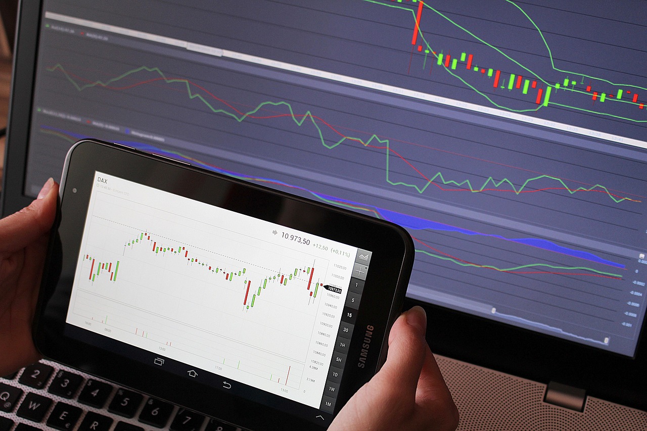
Technical Analysis Tools form the backbone of modern CFD trading, providing traders with a systematic way to interpret price action, assess market sentiment, and make informed decisions. In the context of an Advanced Certificate in CFD Trading, a deep familiarity with the terminology associated with these tools is essential. The following exposition covers the most frequently encountered terms, explains their meanings, illustrates practical applications, and highlights common challenges that traders may face when employing each tool.
Price Charts and Timeframes The foundation of any technical analysis is the price chart. Charts display historical price data in various formats, the most common being candlestick, bar, and line charts. A candlestick chart shows the open, high, low, and close (OHLC) for each period, providing a visual summary of market dynamics. A bar chart also displays OHLC values but uses a different visual representation, while a line chart connects closing prices with a continuous line, offering a smoother view of price trends.
Timeframes refer to the length of each chart interval. Common timeframes include 1‑minute, 5‑minute, 15‑minute, 1‑hour, 4‑hour, daily, weekly, and monthly. The choice of timeframe influences the granularity of information: Short timeframes reveal intraday volatility and are useful for scalping, whereas longer timeframes highlight broader market trends and are suited for swing or position trading. Understanding the relationship between timeframes is crucial; a trader might identify a bullish trend on a daily chart while spotting a short‑term pullback on a 15‑minute chart, creating a multi‑timeframe trading strategy.
Trend Identification Tools Identifying the prevailing market direction is the first step in many trading systems. Several tools help traders determine whether a market is trending upward, downward, or moving sideways.
Trendlines are straight lines drawn on a chart to connect a series of higher lows in an uptrend or lower highs in a downtrend. When a price consistently respects a trendline, it suggests that market participants are maintaining the same directional bias. A break of a trendline often signals a potential reversal or a change in market sentiment. For example, if a trader draws an uptrend line connecting the lows of a rising EUR/USD pair and the price closes below that line, the trader may interpret the breach as a warning sign to tighten stops or consider a short position.
Moving Averages smooth price data by averaging a set number of periods, reducing noise and revealing the underlying direction. Two primary types are the Simple Moving Average (SMA) and the Exponential Moving Average (EMA). The SMA assigns equal weight to each period, while the EMA places greater emphasis on recent prices, making it more responsive to market changes. Commonly used periods include 20, 50, 100, and 200. A “golden cross” occurs when a short‑term moving average (e.G., 50‑Day SMA) crosses above a long‑term moving average (e.G., 200‑Day SMA), indicating bullish momentum. Conversely, a “death cross” signals bearish momentum when the short‑term average moves below the long‑term average.
Moving Average Convergence Divergence (MACD) combines two EMAs—typically the 12‑period and 26‑period—to generate a momentum oscillator. The MACD line is the difference between these EMAs, and a 9‑period EMA of the MACD line, called the signal line, is plotted alongside it. When the MACD line crosses above the signal line, it is interpreted as a bullish signal; a cross below is bearish. Additionally, the distance between the two lines reflects the strength of momentum. Traders often use MACD histograms, which display the difference between the MACD line and the signal line as bars, to spot accelerating or decelerating momentum.
Average Directional Index (ADX) quantifies trend strength without indicating direction. ADX values range from 0 to 100; values above 25 generally suggest a strong trend, while values below 20 indicate a ranging market. ADX is calculated using the Positive Directional Indicator (+DI) and Negative Directional Indicator (‑DI). When +DI exceeds ‑DI, the market is considered bullish; the opposite holds for bearish conditions. A common challenge with ADX is that it lags price action, so traders often combine it with faster indicators such as MACD to confirm trend changes.
Momentum Oscillators Momentum oscillators measure the speed and magnitude of price changes, providing insight into overbought or oversold conditions, potential reversals, and the underlying strength of a trend.
Relative Strength Index (RSI) is a bounded oscillator ranging from 0 to 100, calculated by comparing average gains to average losses over a specified period (commonly 14 periods). Readings above 70 typically indicate that an asset is overbought, while readings below 30 suggest oversold conditions. However, in strong trends, RSI can remain in extreme zones for extended periods; thus, traders often look for divergence—when price makes a new high but RSI fails to do so—as a reversal signal. For instance, if the price of a gold CFD makes a higher high while the RSI forms a lower high, the divergence may warn of an impending pullback.
Stochastic Oscillator compares a security’s closing price to its price range over a given period, producing two lines: %K and %D (the latter being a moving average of %K). Values above 80 are considered overbought; values below 20 are oversold. Like RSI, stochastic can remain in extreme zones during strong trends, so divergence and crossovers between %K and %D are used to enhance signal reliability. A common application is the “Stochastic %K cross above %D in an oversold region,” which many traders interpret as a short‑term bullish entry.
Commodity Channel Index (CCI) measures the deviation of price from its statistical mean. Positive CCI values suggest that price is above average, while negative values indicate below‑average price. Values above +100 are often deemed overbought, and values below –100 are considered oversold. CCI is less commonly used than RSI or stochastic, but it can be effective when combined with trend filters such as moving averages. For example, a trader might look for a CCI crossing from negative to positive while the price is above a 50‑day SMA, confirming a bullish breakout.
Rate of Change (ROC) calculates the percentage change between the current price and the price n periods ago. Positive ROC values indicate upward momentum, while negative values indicate downward momentum. ROC is particularly useful for detecting acceleration in price movements. A rapid increase in ROC can precede a breakout, prompting traders to consider entry points before the price fully materializes.
Volatility Indicators Volatility measures the degree of price fluctuation and is a crucial component of risk management, position sizing, and option pricing.
Bollinger Bands consist of a middle band (usually a 20‑period SMA) and two outer bands placed a set number of standard deviations (commonly two) away from the middle band. The width of the bands expands during periods of high volatility and contracts during low volatility. Traders often interpret a price touching the upper band as a potential overbought signal, while touching the lower band may indicate oversold conditions. However, the bands are not strict support or resistance levels; rather, they adapt to market dynamics. A classic strategy involves buying when price reverts from the lower band toward the middle band in a ranging market, or shorting when price reverts from the upper band in a similar context.
Average True Range (ATR) quantifies market volatility by measuring the average of the true range over a specified period, typically 14. The true range is the greatest of three values: The current high minus the current low, the absolute value of the current high minus the previous close, and the absolute value of the current low minus the previous close. ATR does not indicate direction, only the magnitude of price movement. Traders often use ATR to set stop‑loss distances; for example, a stop may be placed one or two ATRs below entry in a long position to accommodate normal price swings while protecting against adverse moves.
Chaikin Volatility measures the change in the spread between high and low prices over a defined period. An expanding spread suggests increasing volatility, while a contracting spread indicates decreasing volatility. This indicator can be paired with other tools to confirm breakout potential. For instance, a narrowing Bollinger Band combined with rising Chaikin Volatility may hint at an imminent expansion, prompting a trader to prepare for a breakout trade.
Volume‑Based Tools Volume reflects the number of contracts traded and provides insight into the strength behind price moves. While price can move on low volume, strong moves accompanied by high volume are generally considered more reliable.
On‑Balance Volume (OBV) accumulates volume based on price direction: When price closes higher than the previous close, the period’s volume is added to the OBV line; when price closes lower, volume is subtracted. A rising OBV suggests that buying pressure is accumulating, even if price remains flat, while a falling OBV indicates selling pressure. Divergence between OBV and price is a powerful signal; for example, if price makes a new high but OBV fails to confirm, the divergence may foreshadow a reversal.
Volume Profile displays the amount of volume traded at each price level over a selected period, producing a histogram on the vertical axis. The most traded price range is called the Point of Control (POC), and the areas where most volume accumulates are identified as value areas. Traders often use the POC as a reference for support or resistance, as price tends to gravitate toward levels where significant market participation has occurred. A practical application involves entering long positions near the lower edge of the value area and placing targets near the POC, assuming the market respects the volume‑derived balance.
Accumulation/Distribution Line (A/D) combines price and volume to gauge whether a security is being accumulated (bought) or distributed (sold). The line is calculated by weighting volume by the position of the close within the high‑low range. A rising A/D line suggests accumulation, while a falling line indicates distribution. Divergence with price can be used to anticipate trend changes, similar to OBV.
Chart Patterns and Candlestick Formations Pattern recognition is a core skill in technical analysis, as recurring price structures often precede predictable outcomes.
Head and Shoulders is a reversal pattern comprising three peaks: A higher middle peak (the head) flanked by two lower peaks (the shoulders). The pattern can appear at market tops (regular head and shoulders) or bottoms (inverse head and shoulders). The neckline—drawn through the troughs between the peaks—serves as a trigger level. A breakout below the neckline in a regular head and shoulders indicates a bearish reversal, while a breakout above the neckline in an inverse pattern signals a bullish reversal. The price target is typically estimated by measuring the vertical distance from the head to the neckline and projecting it from the breakout point.
Double Top and Double Bottom patterns consist of two peaks (or troughs) at similar price levels, separated by a moderate retracement. The double top signals a bearish reversal, while the double bottom indicates a bullish reversal. The pattern is considered complete when price breaks the intervening low (double top) or high (double bottom). The pattern’s height—measured from the peaks to the intervening low—provides a target projection, similar to the head and shoulders method.
Triangles—symmetrical, ascending, and descending—are continuation patterns that reflect a period of consolidation. In a symmetrical triangle, both the upper and lower trendlines converge, indicating decreasing volatility and an eventual breakout. An ascending triangle features a flat upper trendline and rising lower trendline, suggesting bullish bias, while a descending triangle has a flat lower trendline and falling upper trendline, indicating bearish bias. The breakout direction often confirms the prevailing trend, and the price target can be estimated by projecting the height of the triangle from the breakout point.
Candlestick Patterns convey market psychology through the shape of individual bars. Key formations include:
- Doji: A candle with a very small body, indicating indecision. When appearing after a strong trend, a Doji may signal an impending reversal. - Hammer and Hanging Man: Both have small bodies, long lower shadows, and little or no upper shadow. The hammer appears after a downtrend (bullish reversal), while the hanging man appears after an uptrend (bearish reversal). - Engulfing patterns: A larger candle completely engulfs the previous candle’s body. A bullish engulfing (large green candle after a small red candle) suggests a reversal to the upside; a bearish engulfing signals the opposite. - Morning Star and Evening Star: Three‑candle patterns that indicate strong reversals. The morning star appears after a downtrend and consists of a long red candle, a short candle (often a Doji), and a long green candle; the evening star is its bearish counterpart.
Understanding the context in which these patterns appear is vital. A hammer that forms near a major support level carries more weight than one that appears in the middle of a range. Moreover, the reliability of candlestick patterns improves when confirmed by other indicators, such as a rising RSI or a breakout above a moving average.
Fibonacci Tools Fibonacci ratios stem from the mathematical sequence discovered by Leonardo Fibonacci, where each number is the sum of the two preceding numbers. The most widely used ratios—0.236, 0.382, 0.500, 0.618, And 0.786—Are employed to predict potential support and resistance zones.
Fibonacci Retracement is drawn by connecting a swing high to a swing low (or vice versa) on a chart. Horizontal lines are then placed at the key Fibonacci percentages of the vertical distance. Traders watch these levels for potential price reversals or continuations. For instance, in an uptrend, a pullback to the 61.8% Retracement level may provide a buying opportunity if other confirmation signals—such as a bullish candlestick pattern or a MACD crossover—are present.
Fibonacci Extension projects potential future price targets beyond the original swing. By extending the 100% line and adding the 127.2% And 161.8% Levels, traders can estimate where a strong trend might encounter resistance. Extensions are useful for setting profit targets after a breakout. A practical example: After a price breaks above a previous swing high, a trader may aim for the 127.2% Extension as a realistic target, while using the 161.8% Level as a secondary objective.
Fibonacci Fan and Arc are less common but serve similar purposes. Fans consist of diagonal lines drawn from a swing point at Fibonacci angles, providing dynamic support and resistance. Arcs are circular curves that emanate from a swing point, indicating potential zones of interest. These tools are often combined with trendlines and moving averages for a multi‑layered analysis.
Ichimoku Cloud The Ichimoku Kinko Hyo—commonly called the Ichimoku Cloud—offers a comprehensive view of trend, momentum, and support/resistance in a single chart. It comprises five components:
1. Tenkan‑sen (Conversion Line): The average of the highest high and lowest low over the past nine periods. 2. Kijun‑sen (Base Line): The average of the highest high and lowest low over the past 26 periods. 3. Chikou Span (Lagging Span): The current closing price plotted 26 periods back. 4. Senkou Span A (Leading Span A): The average of Tenkan‑sen and Kijun‑sen plotted 26 periods forward. 5. Senkou Span B (Leading Span B): The average of the highest high and lowest low over the past 52 periods, plotted 26 periods forward.
The area between Senkou Span A and Senkou Span B forms the “cloud.” When the price is above the cloud, the market is considered bullish; when below, bearish. The cloud itself acts as dynamic support or resistance. A “Kumo Breakout”—where price moves from one side of the cloud to the other—often signals a significant trend change. Traders also watch for “Tenkan‑sen/Kijun‑sen crossovers” (analogous to moving‑average crossovers) for entry signals. The Ichimoku system can appear complex, but its integrated nature reduces the need for multiple separate indicators.
Pivot Points and Support/Resistance Levels Pivot points are calculated levels that traders use to gauge potential intraday support and resistance. The most common method uses the prior period’s high, low, and close:
- Pivot (P) = (High + Low + Close) / 3 - Resistance 1 (R1) = (2 × P) – Low - Support 1 (S1) = (2 × P) – High - Resistance 2 (R2) = P + (High – Low) - Support 2 (S2) = P – (High – Low)
Additional levels (R3, S3) can be derived for broader market contexts. Traders often place orders near these levels, anticipating that price will react to them. For example, a trader may set a buy stop just above R1, expecting a breakout, and a stop‑loss just below S1 to limit risk. Pivot points are especially popular among day traders because they provide objective reference points that are recalculated each day.
Support and Resistance are fundamental concepts representing price levels where buying (support) or selling (resistance) pressure historically intensifies. These levels can be identified by prior swing highs and lows, trendlines, moving averages, or psychological round numbers (e.G., 1.3000 In EUR/USD). Breakouts through strong resistance often lead to rapid price acceleration, while rebounds from support can initiate reversal moves. However, false breakouts are common, making confirmation essential. A typical approach involves waiting for a breakout candle that closes beyond the level, accompanied by increased volume and a confirming indicator such as MACD.
Advanced Tools and Concepts Beyond the core set of indicators, advanced traders explore more nuanced methods that incorporate geometry, market cycles, and statistical analysis.
Gann Angles are based on the work of W.D. Gann, who believed that price moves at a constant rate over time. Gann angles are drawn from a swing point at various slopes (e.G., 1X1, 2x1, 1x2). A 1x1 line (45°) suggests that for every unit of price movement, there is an equal unit of time, forming a balanced trend. Prices intersecting these angles may encounter support or resistance. While Gann analysis can be subjective, some traders integrate it with other tools to refine entry timing.
Elliott Wave Theory posits that market prices move in repetitive fractal patterns consisting of five impulse waves in the direction of the main trend followed by three corrective waves. The theory provides a framework for counting wave structures and projecting future price moves. Practical application requires skill in wave identification and often involves using Fibonacci ratios to estimate the length of corrective waves. Critics argue that wave counting can be ambiguous; therefore, many traders use Elliott Wave as a high‑level perspective rather than a precise entry trigger.
Market Profile extends the concept of volume profile by incorporating time, creating a three‑dimensional view of price, volume, and time. The “TPO” (Time Price Opportunity) chart displays the distribution of price over the trading day, highlighting the “value area” where 70% of trading activity occurs. The “point of control” (POC) is the price level with the highest TPO count. Market Profile is valuable for identifying market structure, auction dynamics, and potential breakout zones.
Statistical Indicators such as Z‑Score and Standard Deviation can be applied to price series to assess how far price deviates from its mean. A high Z‑Score indicates that price is far from the average, potentially signaling an overextended condition. Traders may combine Z‑Score with Bollinger Bands to enhance extreme‑value detection.
Correlation Analysis examines the relationship between different assets. For CFD traders, understanding correlation between indices, commodities, and currencies can improve portfolio diversification and hedging strategies. A correlation coefficient close to +1 suggests that assets move together, while a coefficient near –1 indicates inverse movement. Correlation matrices can be built using historical returns, and traders may adjust exposure based on changing correlation dynamics.
Risk Management Metrics are not technical indicators per se, but they are essential vocabulary for any advanced trader. Key terms include:
- Risk‑Reward Ratio: The proportion of potential profit to potential loss for a given trade. A common target is a minimum ratio of 2:1. - Position Size: The number of contracts or notional value allocated to a trade, usually determined by a percentage of account equity (e.G., 1–2% Risk per trade). - Maximum Drawdown: The largest peak‑to‑trough decline in account equity over a defined period, used to assess risk exposure. - Value‑At‑Risk (VaR): A statistical measure that estimates the maximum expected loss over a specified horizon at a given confidence level (e.G., 95%). - Margin Requirement: The amount of capital that must be held to open a CFD position, expressed as a percentage of the trade’s notional value.
Applying these concepts in conjunction with technical analysis tools ensures that trade decisions are not only based on market signals but also aligned with prudent risk controls.
Practical Application Workflow To illustrate how these terms interlock in a real‑world trading scenario, consider the following step‑by‑step workflow that a CFD trader might follow when preparing a trade on a major equity index:
1. Identify the Trend: Examine the daily chart and apply a 200‑day SMA. If the price is above the SMA, the trend is bullish. Confirm with ADX; a reading above 25 strengthens confidence in the trend’s presence.
2. Locate Key Levels: Use pivot points from the previous day to mark potential intraday support and resistance. Overlay the 20‑period Bollinger Bands to gauge volatility. Identify recent swing highs and lows to define additional support/resistance zones.
3. Assess Momentum: Apply the RSI (14) and MACD (12,26,9). If RSI is near 55 and MACD line is above the signal line, momentum supports a continuation bias.
4. Check Volume Confirmation: Look at OBV for accumulation. A rising OBV concurrent with price climbing above a swing high suggests genuine buying pressure.
5. Search for Pattern Signals: Scan for chart patterns such as an ascending triangle. If the price is forming higher lows while respecting a flat upper trendline, the pattern indicates a likely breakout to the upside.
6. Set Entry and Exit: Place a buy stop just above the triangle’s upper trendline (e.G., 0.5% Above the breakout level). Set a stop‑loss below the lower trendline, using ATR to determine an appropriate distance (e.G., 1.5 × ATR). Define profit targets at the 1‑hour chart’s R1 and R2 pivot levels, adjusting for risk‑reward.
7. Confirm with Secondary Tools: Verify that the price is also above the Ichimoku cloud and that the Tenkan‑sen is above the Kijun‑sen, reinforcing the bullish bias.
8. Monitor the Trade: As the trade progresses, watch for divergence between price and OBV or RSI, which may signal early weakening. Adjust stop‑loss to break‑even once the price moves a favorable amount (e.G., 1 × ATR).
9. Post‑Trade Review: Record the outcome, noting which indicators aligned and which gave false signals. Analyze any discrepancies to refine future setups.
By systematically integrating the terminology and tools described above, a trader can construct a robust analytical framework that reduces reliance on guesswork and enhances decision quality.
Common Challenges and Mitigation Strategies Even seasoned traders encounter difficulties when applying technical analysis tools. Recognizing these pitfalls and employing mitigation techniques is essential for sustained success.
Signal Overload occurs when a trader monitors too many indicators simultaneously, leading to analysis paralysis. The remedy is to select a concise set of complementary tools—typically one trend filter, one momentum oscillator, and one volatility measure—and stick to them. Consistency in tool selection helps develop intuition for how each indicator behaves in different market regimes.
Lagging Nature of Indicators is inherent to most moving averages and trend‑following tools. To counteract lag, traders may combine a lagging indicator (e.G., SMA) with a leading indicator (e.G., Stochastic) to capture both the overall direction and potential turning points. Additionally, adjusting the period length—using shorter periods for faster response—can reduce lag but may increase noise; finding the optimal balance requires back‑testing.
False Breakouts are common in range‑bound markets, where price briefly pierces a support or resistance level before reversing. Traders can mitigate this risk by requiring confirmation: A breakout candle that closes beyond the level, accompanied by a volume surge, and a confirming signal from an oscillator (e.G., MACD crossover). Using “stop‑limit” orders instead of pure market orders can also protect against slippage.
Over‑Reliance on Historical Patterns can be misleading when market conditions shift dramatically (e.G., During high‑impact news events). To address this, traders should incorporate fundamental awareness—such as scheduled economic releases—into their technical workflow. Avoid initiating trades immediately before major announcements unless the strategy explicitly targets volatility spikes.
Misinterpretation of Divergence is a frequent source of error. Divergence between price and an oscillator does not guarantee a reversal; it merely indicates weakening momentum. Confirm divergence with additional signals—such as a trendline break or a candlestick reversal—before acting.
Inadequate Risk Management undermines even the most accurate technical analysis. Traders must calculate position size based on account equity and risk tolerance, place stops at logical levels (e.G., Below recent swing lows), and respect pre‑defined risk‑reward ratios. Leveraging the ATR for stop placement can align stop distances with prevailing volatility, preventing premature exits during normal price swings.
Data Quality and Execution Issues can affect indicator reliability. Ensure that chart data is clean, with no missing bars, and that the CFD broker’s execution platform provides real‑time updates. Delayed or inaccurate data may cause indicators to generate misleading signals, especially for high‑frequency strategies.
Psychological Biases—such as confirmation bias (seeking only information that supports a preconceived view) or anchoring (fixating on a specific price level)—can distort interpretation. Maintaining a trading journal, reviewing each trade objectively, and adhering to a predefined checklist can help counteract these biases.
Back‑Testing and Forward‑Testing are essential steps before deploying any new indicator or combination in a live environment. Back‑testing involves applying the strategy to historical data to assess performance metrics (win rate, average profit/loss, drawdown). Forward‑testing, often performed on a demo account, validates the strategy under live market conditions, exposing any hidden execution challenges or data‑feed latency.
Customization and Adaptation Many platforms allow traders to customize indicator parameters (e.G., Changing the RSI period from 14 to 7). While customization can improve fit to a specific market, over‑optimizing—also known as “curve fitting”—reduces robustness. A balanced approach involves testing a range of parameter values and selecting those that perform consistently across multiple assets and timeframes.
Furthermore, traders may develop hybrid indicators by combining existing ones. For example, a “Smoothed RSI” applies an EMA to the RSI values, reducing noise while preserving the core overbought/oversold signals. Another hybrid is the “MACD‑Stochastic” oscillator, which multiplies the MACD histogram by the stochastic %K value to generate a composite momentum measure. When creating hybrids, it is crucial to understand the mathematical relationships to avoid redundant or contradictory signals.
Algorithmic Integration Advanced CFD traders often automate their strategies using algorithmic platforms. In such contexts, each technical term translates into code variables and functions. For instance, the Moving Average becomes a function that returns an array of averaged prices; the ATR is a routine that computes true ranges and averages them over a sliding window. Understanding the underlying mathematics ensures that the implementation matches the theoretical definition, preventing discrepancies that could arise from platform‑specific defaults (e.G., Different smoothing methods for EMA).
Algorithmic trading also introduces considerations such as latency, order execution speed, and slippage. When designing automated strategies, traders must simulate realistic market conditions, incorporating bid‑ask spreads and latency buffers, to verify that indicator signals remain reliable under execution constraints.
Cross‑Asset Applications While the focus of this vocabulary list is on CFD trading, many technical analysis tools are transferable across asset classes, including equities, commodities, forex, and cryptocurrencies. However, each market exhibits distinct characteristics:
- Forex pairs often display tighter spreads and higher liquidity, making short‑term indicators like stochastic more reliable. - Commodities may have pronounced seasonality, influencing the relevance of certain patterns (e.G., Supply‑driven spikes). - Indices tend to follow broader macro trends, where longer‑term moving averages and ADX are particularly valuable. - Cryptocurrencies exhibit heightened volatility, rendering volatility indicators (ATR, Bollinger Bands) essential for sizing stops.
Adapting indicator parameters to the specific market’s volatility profile improves signal fidelity. For example, a 14‑period ATR may be appropriate for a major equity index, but a 7‑period ATR could better capture rapid price swings in a crypto market.
Integrating Fundamental Context Although the emphasis here is on technical terminology, proficient CFD traders recognize that technical analysis does not operate in a vacuum. Economic releases (e.G., Interest‑rate decisions, employment reports) can cause abrupt price movements that invalidate purely technical expectations. A trader might, therefore, schedule technical analysis sessions after major news events, or use volatility indicators to anticipate increased risk around release windows. Understanding the timing of such events and aligning technical setups accordingly helps avoid unexpected losses.
Continuous Learning and Adaptation Markets evolve, and so do the tools used to analyze them. New indicators emerge, and existing ones are refined. Maintaining fluency with the core vocabulary ensures that a trader can quickly assess and incorporate novel concepts. Participation in professional forums, reviewing research papers on quantitative methods, and regularly revisiting the definitions and applications of foundational terms are all part of an ongoing development process.
In summary, mastery of the key terms and concepts outlined above equips the advanced CFD trader with a comprehensive toolkit for dissecting market behavior. By applying these tools methodically, validating signals through multiple lenses, and adhering to disciplined risk management, traders can enhance the consistency and profitability of their trading endeavors.
Key takeaways
- The following exposition covers the most frequently encountered terms, explains their meanings, illustrates practical applications, and highlights common challenges that traders may face when employing each tool.
- A bar chart also displays OHLC values but uses a different visual representation, while a line chart connects closing prices with a continuous line, offering a smoother view of price trends.
- Understanding the relationship between timeframes is crucial; a trader might identify a bullish trend on a daily chart while spotting a short‑term pullback on a 15‑minute chart, creating a multi‑timeframe trading strategy.
- Trend Identification Tools Identifying the prevailing market direction is the first step in many trading systems.
- For example, if a trader draws an uptrend line connecting the lows of a rising EUR/USD pair and the price closes below that line, the trader may interpret the breach as a warning sign to tighten stops or consider a short position.
- The SMA assigns equal weight to each period, while the EMA places greater emphasis on recent prices, making it more responsive to market changes.
- Traders often use MACD histograms, which display the difference between the MACD line and the signal line as bars, to spot accelerating or decelerating momentum.